Understanding the Basics of Digital Painting and Brush Mechanics
What Makes Digital Brushes Tick?
Imagine holding a paintbrush that contains infinite possibilities, capable of mimicking oils, watercolors, or even a pencil—it all starts with understanding how digital brushes are built. In tablet painting applications, every brush operates based on programmed mechanics. Think of it as a recipe: parameters like texture, opacity, and flow mix together to create the “feel” of the brush on your digital canvas.
Here’s where it gets exciting: each stroke reacts differently based on the pressure and tilt of your stylus. Press harder, and a watercolor brush might create a richer, darker tone. Tilt the stylus, and a charcoal brush might mimic side shading you’d get from dragging a real stick across paper. The magic lies in these dynamic interactions.
- Opacity: Controls how transparent or solid your stroke appears.
- Size Jitter: Changes your brush thickness with pressure variations.
Why Practice—And Play—Matters
Understanding brush mechanics doesn’t mean you have to memorize every setting. Instead, approach this like exploring a treasure chest: doodle, experiment wildly, or layer unexpected textures. Sometimes, the best discoveries come not from following rules but from playful curiosity.
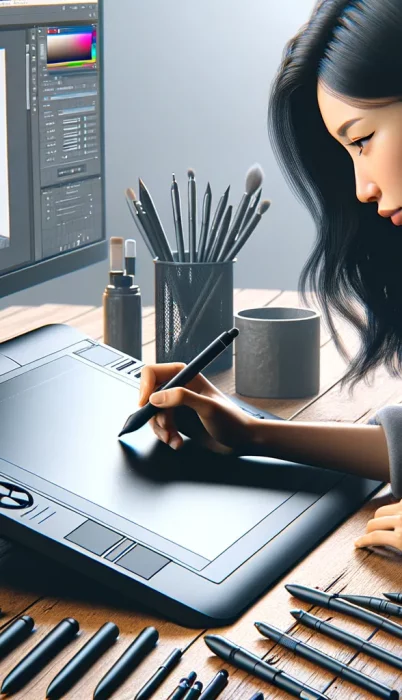
Choosing the Right Tools and Tablet Settings
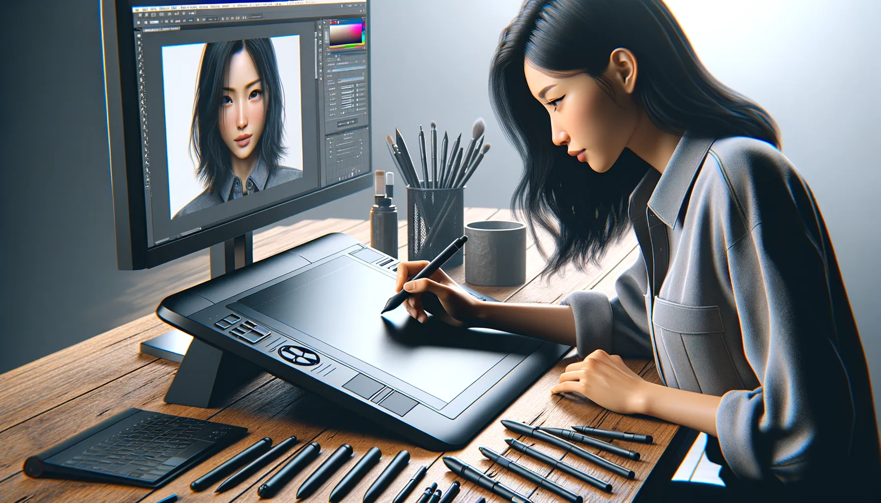
Finding Your Perfect Digital Paintbrush
Picking the right tools for digital painting is like assembling a customized artist’s toolbox – it makes all the difference between struggling with clunky strokes and achieving buttery-smooth realism. Start with your tablet. Is it pressure-sensitive? If not, you’re missing out on an essential part of the tactile painting experience. A good tablet reacts to the weight of your hand, letting you press hard for bold, opaque lines or lightly graze the surface for soft, whispery shading.
Then comes your stylus, the real magic wand here. Look for one with adjustable pressure curves and customizable buttons. Honestly, those shortcut buttons may feel unnecessary at first, but trust me – when you’re in the zone, skipping back to the undo key on your keyboard feels like dragging yourself out of quicksand.
Dialing In Your Tablet Settings
This part’s a game-changer: setting up your tablet to complement your personal flow. Don’t let factory settings hold you back! Tweak that pressure sensitivity curve until it mirrors how you naturally sketch or paint with traditional brushes. For inspiration:
- Are your thin strokes too faint? Adjust the initial pressure threshold higher.
- Want bolder brushstrokes? Play with more linear curves to balance heavy-hand habits.
Lastly, don’t skimp on driver updates for your tablet—they’re like tuning your instrument before a big performance. Brushes won’t glide if your tech isn’t operating at its peak.
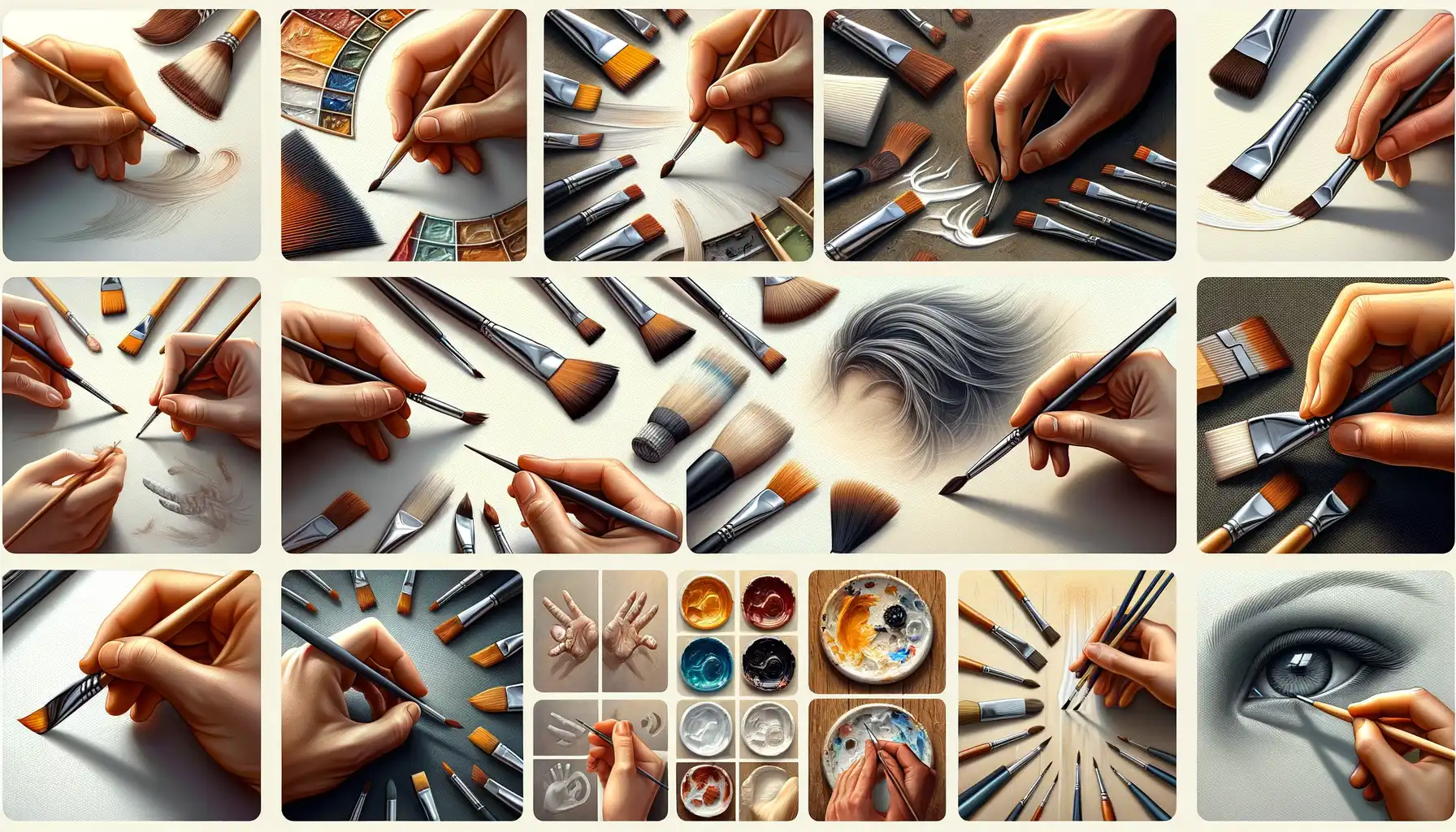
Techniques for Creating Realistic Brush Strokes
Creating Depth and Flow with Layered Strokes
Imagine this: your digital brush gliding across the screen like a dancer, leaving behind lush, layered strokes that breathe life into your artwork. To make this happen, think about how traditional artists build up paint—layers are key! Start with a light touch, using low opacity on your brush settings. By layering semi-transparent strokes, you can mimic the look of actual paint blending on a canvas.
Experiment with pressure sensitivity. The harder you press on your pen tablet, the bolder your stroke becomes, while a softer touch creates delicate lines. It’s as if you’re wielding a real brush—your hand becomes the conductor, dictating the mood of each stroke. Combine this with tools like the smudge brush, and you’ll be amazed at how you can blend edges into subtler gradients.
- Use texture brushes to add depth—wood grain, canvas, or even watercolor effects can elevate realism.
- Vary stroke width by adjusting pressure in real-time. Imagine a feather grazing paper versus carving out bold swaths of color.
The Magic of Imperfection
True to life brushstrokes are rarely perfect—they’re messy, unpredictable, and full of character. Introduce some “happy accidents” into your art. For example, intentionally let your strokes overlap or create subtle streaks by playing with uneven brush spacing. Many tablet applications, such as Procreate and Krita, have customizable jitter controls to randomize the texture and flow of each brushstroke.
Don’t overlook tilt functionality! Tilting your stylus can diversify the angle and shape of your strokes, similar to angling a flat brush for broader coverage. This is brilliant for landscapes like rolling clouds or grassy fields. Explore every pixel of chaos—it’s often where the magic hides.
Common Mistakes and How to Avoid Them

Brush Control Blunders
Ever feel like your brush strokes have a mind of their own? It’s not you—it’s likely the settings or habits tripping you up. One big offender? Over-reliance on the default brushes. Sure, they’re tempting—they’re right there, after all—but default doesn’t equal dynamic. Imagine painting a masterpiece with just one shade of gray: uninspiring. Explore those brush libraries! Fine-tuning settings like opacity, flow, or pressure sensitivity can be the difference between “nice effort” and “wow.”
Another pitfall? The dreaded *over-smoothing.* Yes, we’ve all been there—chasing perfection, tweaking that stroke until it’s so polished it loses its personality. Remember, realism thrives on imperfection. Instead, embrace texture: add in a shaky line, a messy edge, or a touch of chaos to mimic real-life brushwork.
- Poorly Calibrated Pen Pressure: Adjust your tablet settings to match how you naturally hold the stylus. Too hard or too soft, and your strokes will feel… off.
- Ignoring Layer Management: Don’t cram everything onto one layer. Keep strokes separate for easy edits later.
Color Chaos Meets Stroke Disaster
Let’s talk color. You might think, “What does color have to do with *strokes*?” Oh, everything! Picture this: you’ve nailed a beautiful brushstroke but paired it with an off-tone hue. It’s like dressing an elegant cake in neon frosting—no bueno. Create palettes beforehand, and test how strokes blend. Watch as disjointed art suddenly feels cohesive, singing in harmony instead of discord.
Tips for Mastering Digital Painting Over Time
Building Confidence Through Practice and Curiosity
Mastering digital painting isn’t a sprint—it’s like watching a garden grow. It takes time, care, and a little experimentation to see the fruits of your creativity bloom. Start by setting aside regular moments to paint, even if it’s just a quick 15-minute sketch. Consistency is your best friend, and over time, you’ll notice how your hand becomes one with the stylus.
Create personal challenges! Try recreating the texture of tree bark or the shimmer of sunlight on water. These small experiments fine-tune your skills while keeping boredom at bay. And don’t shy away from tutorials—whether it’s a YouTube video or an online art class, there’s always something new to learn.
- Dabble with brushes you’ve never used before—some might surprise you.
- Zoom in to refine tiny details; zoom out to make sure the overall piece flows.
- Experiment with blending modes—multiply, overlay, or even that “weird one” you’ve ignored so far.
Embracing the Beauty of Mistakes
Here’s a truth no one talks about enough: some of your best breakthroughs will come from errors. Maybe that streaky stroke wasn’t what you planned, but step back—it might add unexpected depth. As you play, remember to save iterations of your work. They act as breadcrumbs, showing how far you’ve come and giving you the freedom to experiment without fear of ruining everything.
Also, get cozy with imperfection. Not every painted petal or shadow will be flawless—and that’s okay. Art thrives in quirks and human touches. As long as you’re growing (even by inches), you’re succeeding.