Introduction to Vector and Raster Graphics
Imagine swiping through your favorite design app, zooming into flawless details, or marveling at how crisp an icon looks, no matter the screen size. That, my friend, is the magic of vector and raster graphics. Whether you’re designing for sleek mobile interfaces or bold digital illustrations, understanding these formats isn’t just helpful—it’s transformative.
What Are Vector Graphics?
Think of vectors as the “math nerds” of design. They rely on paths, points, and equations to create images that are infinitely scalable. No matter if it’s a tiny favicon or a billboard-sized ad, a vector graphic maintains perfect resolution. Imagine designing a minimalist logo with clean lines—vectors make it razor-sharp, whether it’s on an Apple Watch or Times Square.
The Personality of Rasters
If vectors are math, rasters are painters—a symphony of pixels coming together to form vibrant images. These are your richly detailed photographs and texture-packed illustrations. But there’s a catch: resizing rasters can lead to that dreaded blurry mess. Let’s say you take an Instagram-worthy photo; it’s perfect as-is, but blow it up too big, and pixelation will quickly gatecrash the party.
- Vector: Crisp logos, SVG icons, geometric designs.
- Raster: Photo-realistic art, detailed textures, dynamic lighting.
With these two creative powerhouses in your toolkit, you’re ready to align your artistic ambitions with technical precision!
Key Differences Between Vector and Raster Design
The Artistic Core: Shapes vs. Pixels
When diving into the world of design, one of the most critical distinctions lies in how vector and raster graphics are built at their core. Think of vectors as a “connect-the-dots” masterpiece. Using mathematical equations, they create smooth, scalable shapes that stay razor-sharp no matter how much you zoom in or resize them. This is why logos, icons, and typography often live in the vector universe—they’re precision tools for crisp perfection.
On the flip side, rasters are like mosaics made from tiny tiles called pixels. Each pixel is packed with rich color and tone, which makes raster designs ideal for intricate, photo-realistic illustrations. But here’s the catch: blow up a raster image too much, and those tiles get blurry—enter the infamous “pixelation effect!”
- Scalability: Vector files grow with you; raster files can’t stretch without losing quality.
- Detail: Rasters shine for texture-rich work like photos; vectors stick to clean shapes and lines.
The real magic? Knowing when to think like a painter (raster) versus when to think like an architect (vector).
Advantages and Disadvantages of Vector and Raster Formats in Mobile Design
The Ups and Downs of Vectors in Mobile Design
When it comes to mobile design, vector graphics shine brightly like a designer’s secret weapon. Why? They’re resolution-independent. Imagine you’re creating icons for a sleek app—vectors ensure those icons look razor-sharp whether they’re displayed on a tiny smartwatch or a massive tablet. Resizing? No problem. Stretch them, shrink them, distort them, and they’ll never pixelate. It’s like magic for your visuals.
But, even heroes have flaws. Vectors aren’t ideal for intricate textures or photorealistic elements. Think about a close-up image of a snowflake or a steaming hot latte—it’s raster’s playground, not vector’s. Plus, complex vector files can weigh more than you’d expect, potentially slowing down performance in heavy animations. Essentially, vectors are the minimalist’s dream but lose their charm when realism takes center stage.
The Real Talk About Raster Formats
Raster formats, meanwhile, excel at capturing life’s incredible details. They’re the reason product photography, wallpapers, and splash screens pop with lifelike clarity. Need a gradient-rich background for your login screen? Raster is your loyal companion.
However, let’s talk limitations.
- Scalability issues: Rasters hate being resized. Zoom in, and you’re diving into a world of blurry pixels.
- Hefty file sizes: High-res images demand storage space and can wreak havoc on load times—no one likes a sluggish app.
Choose wisely—it’s all about understanding what your design story demands!
When to Use Vector or Raster Design in Digital Illustration
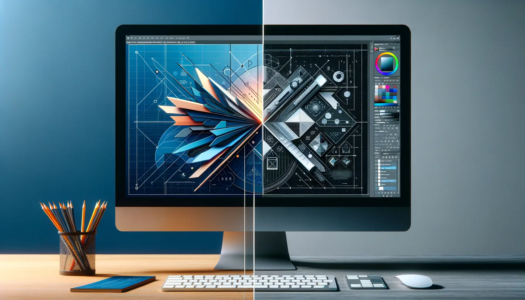
Choosing the Right Path: Vector for Precision, Raster for Detail
Imagine you’re crafting a digital masterpiece—what’s your priority? Is it crisp lines that could hold their ground even on a billboard, or intricate details that feel like they could leap off the screen? Here’s where the decision between vector and raster design comes into play.
If your art needs to scale endlessly without losing clarity (think logos or UI icons), vectors are your best friend. These graphics use math-based paths rather than pixels, meaning whether they’re viewed on a smartwatch or splashed across a stadium jumbotron, they stay razor-sharp. Picture a sleek, professional logo. That’s the magic of vector design.
But when your goal is all about richly textured, photorealistic art—like a digitally painted character illustration—nothing beats the depth and nuance of raster graphics. With a raster design, you can blend colors like mixing paint on a real palette, producing lifelike gradients and shadows.
- Use Vector: Geometric illustrations, sharp typography, scalable designs.
- Use Raster: Digital paintings, detailed photo edits, layered compositions.
Ultimately, it’s not about “better”—it’s about choosing the *perfect tool* for the story your artwork needs to tell. Which one feels right to you?
Tips and Tools for Creating Vector and Raster Graphics
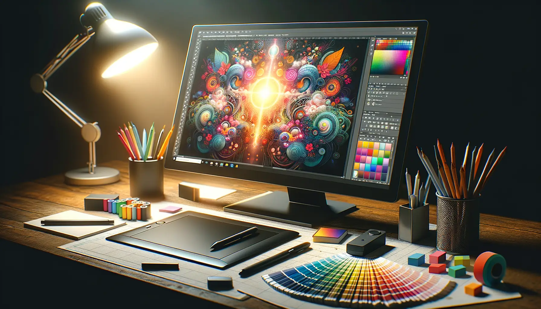
Mastering Your Craft: Essential Tools to Bring Your Ideas to Life
Whether you’re breathing life into crisp, scalable vector illustrations or delving into the rich, textured world of raster design, your tools can make or break your creative journey. Let’s start with the essentials:
- Adobe Illustrator: The gold standard for vector work. Perfect for logos, icons, or anything that needs precision. Plus, its pen tool is a dream for perfectionists.
- Procreate: A raster dynamo catering to tablet users. Think of it as wielding a paintbrush dipped in digital magic.
- Affinity Designer: Like a chameleon, it handles both vectors and rasters seamlessly. Ideal when you need the best of both worlds in one place.
Tips to Keep Your Creativity Flowing
Here’s something no one tells you: design isn’t just about skills; it’s about mindset. Start by embracing imperfection. Even the best designs begin as messy drafts!
Secondly, always work smarter with layers—name them, sort them, and avoid descending into “layer chaos.” Trust me, future you will thank present you.
And the ultimate secret? Experiment freely but remember your end goal. If you’re crafting a game icon, think sharp details and vibrant colors (vector shines here). Illustrating a full-page comic? Bask in the beauty of raster textures!
Think of these tips as the breadcrumbs leading to your masterpiece. Now, go paint the digital universe with brilliance!